The Research Group is Moving!
During winter term 2021/22, we move to University of Bamberg. From Oct. 15, 2021, Fabian Beck holds a full professor position on Information Visualization.
New webpage of the research group: https://www.uni-bamberg.de/vis
Team

Academic Staff
Shahid Latif
- Room:
- S-GW 313
- Phone:
- +49 201 18-34654
- Email:
- shahid.latif (at) uni-due.de
- Consultation Hour:
- By appointment
- Address:
- Universität Duisburg-Essen
Gerlingstraße 16
45127 Essen, Germany
Bio:
Shahid Latif is a doctoral candidate in Computer Science. He holds a Master degree in Electrical and Computer Engineering.
Fields of Research:
His research interests include visualizing spatio-temporal data, geographic visualizations, and coherent integration of text and visualizations in the form of interactive web documents. Recently, he is working on creating adaptable and interactive data reports by combining the visual analytics systems with automatically generated natural language text.
Checkout his Google Scholar and ResearchGate profiles.
Projects:
Shahid is contributing towards the following research projects:
Publications:
- Latif, Shahid; Agarwal, Shivam; Gottschalk, Simon; Chrosch, Carina; Feit, Felix; Jahn, Johannes; Braun, Tobias; Tchenko, Yannick Christian; Demidova, Elena; Beck, Fabian: Visually Connecting Historical Figures Through Event Knowledge Graphs. In: IEEE VIS 2021 - Short Papers. IEEE, 2021, p. 156-160. doi:10.1109/VIS49827.2021.9623313PDFCitationAbstractDetails
Knowledge graphs store information about historical figures and their relationships indirectly through shared events. We developed a visualization system, VisKonnect, for analyzing the intertwined lives of historical figures based on the events they participated in. A user’s query is parsed for identifying named entities, and related data is retrieved from an event knowledge graph. While a short textual answer to the query is generated using the GPT-3 language model, various linked visualizations provide context, display additional information related to the query, and allow exploration.
Charts go hand in hand with text to communicate complex data and are widely adopted in news articles, online blogs, and academic papers. They provide graphical summaries of the data, while text explains the message and context. However, synthesizing information across text and charts is difficult; it requires readers to frequently shift their attention. We investigated ways to support the tight coupling of text and charts in data documents. To understand their interplay, we analyzed the design space of chart–text references through news articles and scientific papers. Informed by the analysis, we developed a mixed-initiative interface enabling users to construct interactive references between text and charts. It leverages natural language processing to automatically suggest references as well as allows users to manually construct other references effortlessly. A user study complemented with algorithmic evaluation of the system suggests that the interface provides an effective way to compose interactive data documents.
Data-driven stories comprise of visualizations and a textual narrative. The two representations coexist and complement each other. Although existing research has explored the design strategies and structure of such stories, it remains an open research question how the two representations play together on a detailed level and how they are linked with each other. In this paper, we aim at understanding the fine-grained interplay of text and visualizations in geographic data-driven stories. We focus on geographic content as it often includes complex spatiotemporal data presented as versatile visualizations and rich textual descriptions. We conduct a qualitative empirical study on 22 stories collected from a variety of news media outlets; 10 of the stories report the COVID-19 pandemic, the others cover diverse topics. We investigate the role of every sentence and visualization within the narrative to reveal how they reference each other and interact. Moreover, we explore the positioning and sequence of various parts of the narrative to find patterns that further consolidate the stories. Drawing from the findings, we discuss study implications with respect to best practices and possibilities to automate the report generation.
Building upon the ideas of storytelling and explorable explanations, we introduce Talking Realities, a concept for producing data-driven interactive narratives in virtual reality. It combines an audio narrative with an immersive visualization to communicate analysis results. The narrative is automatically produced using template-based natural language generation and adapts to data and user interactions. The synchronized animation of visual elements in accordance with the audio connects the two representations. In addition, we discuss various modes of explanation ranging from fully guided tours to free exploration of the data. We demonstrate the applicability of our concept by developing a virtual reality visualization for air traffic data. Furthermore, generalizability is exhibited by sketching mock-ups for two more application scenarios in the context of information and scientific visualization.
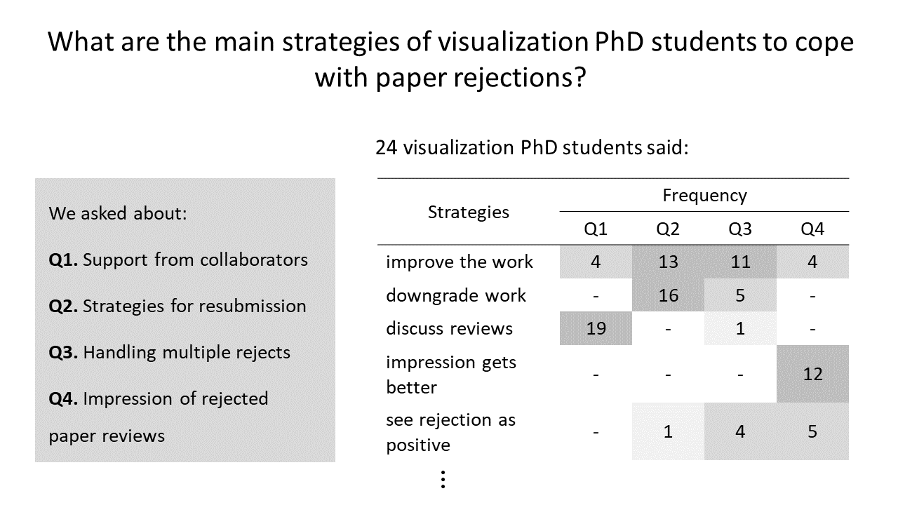
- Agarwal, Shivam; Latif, Shahid; Beck, Fabian: How Visualization PhD Students Cope with Paper Rejections. In: IEEE Workshop Celebrating the Scientific Value of Failure (FailFest). 2020, p. 6-10. doi:10.1109/FailFest51498.2020.00006PDFCitationAbstractDetails
We conducted a questionnaire study aimed towards PhD students in the field of visualization research to understand how they cope with paper rejections. We collected responses from 24 participants and performed a qualitative analysis of the data in relation to the provided support by collaborators, resubmission strategies, handling multiple rejects, and personal impression of the reviews. The results indicate that the PhD students in the visualization community generally cope well with the negative reviews and, with experience, learn how to act accordingly to improve and resubmit their work. Our results reveal the main coping strategies that can be applied for constructively handling rejected visualization papers. The most prominent strategies include: discussing reviews with collaborators and making a resubmission plan, doing a major revision to improve the work, shortening the work, and seeing rejection as a positive learning experience.
- Mumtaz, Haris; Latif, Shahid; Beck, Fabian; Weiskopf, Daniel: Exploranative Code Quality Documents. In: IEEE Transactions on Visualization and Computer Graphics, Vol 26 (2020) No 1, p. 1129-1139. doi:10.1109/TVCG.2019.2934669PDFCitationAbstractDetails
Good code quality is a prerequisite for efficiently developing maintainable software. In this paper, we present a novel approach to generate exploranative (explanatory and exploratory) data-driven documents that report code quality in an interactive, exploratory environment. We employ a template-based natural language generation method to create textual explanations about the code quality, dependent on data from software metrics. The interactive document is enriched by different kinds of visualization, including parallel coordinates plots and scatterplots for data exploration and graphics embedded into text. We devise an interaction model that allows users to explore code quality with consistent linking between text and visualizations; through integrated explanatory text, users are taught background knowledge about code quality aspects. Our approach to interactive documents was developed in a design study process that included software engineering and visual analytics experts. Although the solution is specific to the software engineering scenario, we discuss how the concept could generalize to multivariate data and report lessons learned in a broader scope.
- Latif, Shahid; Su, Kaidie; Beck, Fabian: Authoring Combined Textual and Visual Descriptions of Graph Data. In: EuroVis 2019 - Short Papers. The Eurographics Association, 2019. doi:10.2312/evs.20191180PDFCitationAbstractDetails
The interactive linking of text and visualizations supports easy and guided exploration of information and results in a coherent
document. Authoring such documents for the web requires writing custom HTML and JavaScript. Existing research aims at
reducing the effort by providing a declarative syntax. However, these approaches either do not support the interactive linking
of text and visualizations or require advance programming skills to establish this linking. Targeting a specific type of data i.e.,
graph data, we introduce an approach that uses a declarative syntax to produce interactive documents and requires little to no
programming. Based on the user specifications in an HTML file, the system queries the database to retrieve subgraphs and link
them to the relevant text fragments. The resulting document consists of a node-link diagram and text; the two representations
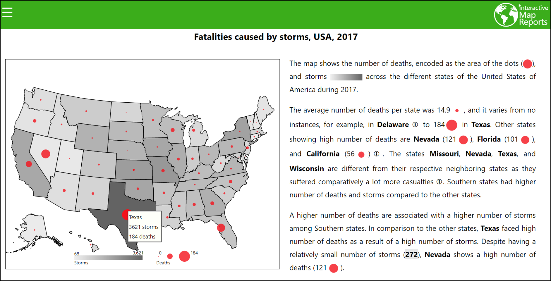
are closely linked via interactions and word-sized graphics, and provide an active reading experience. - Latif, Shahid; Beck, Fabian: Interactive Map Reports Summarizing Bivariate Geographic Data. In: Visual Informatics, Vol 3 (2019) No 1, p. 27-37. doi:10.1016/j.visinf.2019.03.004PDFCitationAbstractDetails
Bivariate map visualizations use different encodings to visualize two variables but comparison across multiple encodings is challenging. Compared to a univariate visualization, it is significantly harder to read regional differences and spot geographical outliers. Especially targeting inexperienced users of visualizations, we advocate the use of natural language text for augmenting map visualizations and understanding the relationship between two geo-statistical variables. We propose an approach that selects interesting findings from data analysis, generates a respective text and visualization, and integrates both into a single document. The generated reports interactively link the visualization with the textual narrative. Users can get additional explanations and have the ability to compare different regions. The text generation process is flexible and adapts to various geographical and contextual settings based on small sets of parameters. We showcase this flexibility through a number of application examples.
- Latif, Shahid; Beck, Fabian: VIS Author Profiles: Interactive Descriptions of Publication Records Combining Text and Visualization. In: IEEE Transactions on Visualization and Computer Graphics, Vol 25 (2019) No 1, p. 152-161. doi:10.1109/TVCG.2018.2865022PDFCitationAbstractDetails
Publication records and collaboration networks are important for assessing the expertise and experience of researchers. Existing digital libraries show the raw publication lists in author profiles, whereas visualization techniques focus on specific subproblems. Instead, we look at publication records from various perspectives mixing low-level publication data with high-level abstractions and background information. This work presents VIS Author Profiles, a novel approach to generate integrated textual and visual descriptions to highlight patterns in publication records. We leverage template-based natural language generation to summarize notable publication statistics, evolution of research topics, and collaboration relationships. Seamlessly integrated visualizations augment the textual description and are interactively connected with each other and the text. The underlying publication data and detailed explanations of the analysis are available on demand. We compare our approach to existing systems by taking into account information needs of users and demonstrate its usefulness in two realistic application examples.
- Latif, Shahid; Beck, Fabian: Visually Augmenting Documents With Data. In: Computing in Science & Engineering (2018), p. 96-103. doi:10.1109/MCSE.2018.2875316PDFCitationAbstractDetails
“A picture is worth a thousand words” is a famous English saying. It is true in many cases, because a complex idea or data can be simply conveyed through the use of a single static image or diagram. Therefore, inclusion of graphics and visualizations in scientific texts has been an important aspect ever since researchers started publishing articles. Conventional writing styles allow researchers to provide images, graphs, and tables to enhance the readability and understandability of the text, but usually, these large-scale images need to be placed at a slightly different location from the relevant text, either on the same page or on the next pages. This far-off placement of graphics forces readers to switch their attention between text and graphics, which can cause a split-attention effect, thereby increasing the cognitive effort to comprehend the information.
- Latif, Shahid; Liu, Diao; Beck, Fabian: Exploring Interactive Linking Between Text and Visualization. In: EuroVis 2018 - Short Papers. 2018, p. 91-94. doi:10.2312/eurovisshort.20181084PDFCitationAbstractDetails
Visualizations are included in documents as augmentation to text and they become more intuitive if readers have the ability to interact with them. Modern web technologies facilitate the development of interactive documents including both text and visualizations. The aim of this research it to explore the design space of possible visualization–text linking and interactions based on various triggers such as mouse events. We describe a framework that takes text containing markup, a related dataset, and a configuration file as inputs and produces an interactive document. The resulting document provides interactions such as details on demand, visual highlighting and comparison, and bushing-and-linking. In addition to regular sized graphics, the use of word-sized graphics or sparklines presents related content in view-focus of the reader. Finally, an illustrative example is presented to showcase the approach.


