The Research Group is Moving!
During winter term 2021/22, we move to University of Bamberg. From Oct. 15, 2021, Fabian Beck holds a full professor position on Information Visualization.
New webpage of the research group: https://www.uni-bamberg.de/vis
Publications
Publications of the research group since 2016. For earlier publications, please visit Fabian Beck's Google Scholar or DBLP profile.
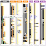
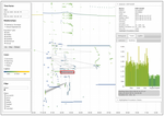
- Tarner, Hagen; Bongard, Daniel Van Den; Beck, Fabian: Visually Analyzing the Structure and Code Quality of Component-based Web Applications. In: Working Conference on Software Visualization (VISSOFT). Luxembourg (virtual) 2021. doi:10.1109/VISSOFT52517.2021.00031PDFCitationAbstractDetails
Monitoring code quality and dependencies is an important task to keep software maintainable. While generally well researched, only little work on visually analyzing code quality of component-based front-end web applications exists that considers the specifics of such software systems. We propose an approach to visualize dependencies and code quality metrics of component-based JavaScript React applications. Our prototype implementation uses a node-link diagram for dependency visualization, tailored to the specific component structure of React applications and enriched with various visual cues. It is linked with different panels to show code quality and exact source code locations. Recommendations on how the quality of the system under analysis can be improved and refactored are provided. We evaluated our prototype in a small user study with four participants and found that it helped in program comprehension tasks and finding refactoring opportunities.
- Krause, Cedric; Agarwal, Shivam; Ghoniem, Mohammad; Beck, Fabian: Visual Comparison of Multi-label Classification Results. In: Vision, Modeling, and Visualization. 2021. doi:10.2312/vmv.20211367PDFCitationAbstractDetails
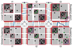
In multi-label classification, we do not only want to analyze individual data items but also the relationships between the assigned labels. Employing different sources and algorithms, the label assignments differ. We need to understand these differences to identify shared and conflicting assignments. We propose a visualization technique that addresses these challenges. In graphs, we present the labels for any classification result as nodes and the pairwise overlaps of labels as links between them. These graphs are juxtaposed for the different results and can be diffed graphically. Clustering techniques are used to further analyze similarities between labels or classification results, respectively. We demonstrate our prototype in two application examples from the machine learning domain.
- Latif, Shahid; Agarwal, Shivam; Gottschalk, Simon; Chrosch, Carina; Feit, Felix; Jahn, Johannes; Braun, Tobias; Tchenko, Yannick Christian; Demidova, Elena; Beck, Fabian: Visually Connecting Historical Figures Through Event Knowledge Graphs. In: IEEE VIS 2021 - Short Papers. IEEE, 2021, p. 156-160. doi:10.1109/VIS49827.2021.9623313PDFCitationAbstractDetails
Knowledge graphs store information about historical figures and their relationships indirectly through shared events. We developed a visualization system, VisKonnect, for analyzing the intertwined lives of historical figures based on the events they participated in. A user’s query is parsed for identifying named entities, and related data is retrieved from an event knowledge graph. While a short textual answer to the query is generated using the GPT-3 language model, various linked visualizations provide context, display additional information related to the query, and allow exploration.
- Latif, Shahid; Zhou, Zheng; Kim, Yoon; Kim, Nam Wook; Beck, Fabian: Kori: Interactive Synthesis of Text and Charts in Data Documents. In: IEEE Transactions on Visualization and Computer Graphics (Preprint), Vol 28 (2021) No 1. PDFCitationAbstractDetails
Charts go hand in hand with text to communicate complex data and are widely adopted in news articles, online blogs, and academic papers. They provide graphical summaries of the data, while text explains the message and context. However, synthesizing information across text and charts is difficult; it requires readers to frequently shift their attention. We investigated ways to support the tight coupling of text and charts in data documents. To understand their interplay, we analyzed the design space of chart–text references through news articles and scientific papers. Informed by the analysis, we developed a mixed-initiative interface enabling users to construct interactive references between text and charts. It leverages natural language processing to automatically suggest references as well as allows users to manually construct other references effortlessly. A user study complemented with algorithmic evaluation of the system suggests that the interface provides an effective way to compose interactive data documents.
- Latif, Shahid; Chen, Siming; Beck, Fabian: A Deeper Understanding of Visualization–Text Interplay in Geographic Data-driven Stories. In: Computer Graphics Forum, Vol 40 (2021) No 3. PDFCitationRecordingAbstractDetails
Data-driven stories comprise of visualizations and a textual narrative. The two representations coexist and complement each other. Although existing research has explored the design strategies and structure of such stories, it remains an open research question how the two representations play together on a detailed level and how they are linked with each other. In this paper, we aim at understanding the fine-grained interplay of text and visualizations in geographic data-driven stories. We focus on geographic content as it often includes complex spatiotemporal data presented as versatile visualizations and rich textual descriptions. We conduct a qualitative empirical study on 22 stories collected from a variety of news media outlets; 10 of the stories report the COVID-19 pandemic, the others cover diverse topics. We investigate the role of every sentence and visualization within the narrative to reveal how they reference each other and interact. Moreover, we explore the positioning and sequence of various parts of the narrative to find patterns that further consolidate the stories. Drawing from the findings, we discuss study implications with respect to best practices and possibilities to automate the report generation.
- Latif, Shahid; Tarner, Hagen; Beck, Fabian: Talking Realities: Audio Guides in Virtual Reality Visualizations. In: IEEE Computer Graphics and Applications (2021). doi:10.1109/MCG.2021.3058129PDFFull textCitationRecordingAbstractDetails
Building upon the ideas of storytelling and explorable explanations, we introduce Talking Realities, a concept for producing data-driven interactive narratives in virtual reality. It combines an audio narrative with an immersive visualization to communicate analysis results. The narrative is automatically produced using template-based natural language generation and adapts to data and user interactions. The synchronized animation of visual elements in accordance with the audio connects the two representations. In addition, we discuss various modes of explanation ranging from fully guided tours to free exploration of the data. We demonstrate the applicability of our concept by developing a virtual reality visualization for air traffic data. Furthermore, generalizability is exhibited by sketching mock-ups for two more application scenarios in the context of information and scientific visualization.
- Agarwal, Shivam; Latif, Shahid; Beck, Fabian: How Visualization PhD Students Cope with Paper Rejections. In: IEEE Workshop Celebrating the Scientific Value of Failure (FailFest). 2020, p. 6-10. doi:10.1109/FailFest51498.2020.00006PDFCitationRecordingAbstractDetails
We conducted a questionnaire study aimed towards PhD students in the field of visualization research to understand how they cope with paper rejections. We collected responses from 24 participants and performed a qualitative analysis of the data in relation to the provided support by collaborators, resubmission strategies, handling multiple rejects, and personal impression of the reviews. The results indicate that the PhD students in the visualization community generally cope well with the negative reviews and, with experience, learn how to act accordingly to improve and resubmit their work. Our results reveal the main coping strategies that can be applied for constructively handling rejected visualization papers. The most prominent strategies include: discussing reviews with collaborators and making a resubmission plan, doing a major revision to improve the work, shortening the work, and seeing rejection as a positive learning experience.
- Tarner, Hagen; Beschastnikh, Ivan; Beck, Fabian: Exploring a Multi-focus Visual Comparison of Dynamic Graphs. In: IEEE Visualization Conference (VIS). 2020. PDFCitationDetails
- Agarwal, Shivam; Tkachev, Gleb; Wermelinger, Michel; Beck, Fabian: Visualizing Sets and Changes in Membership Using Layered Set Intersection Graphs. In: Proceedings of Vision, Modeling, and Visualization. The Eurographics Association, 2020. doi:10.2312/vmv.20201189PDFCitationRecordingAbstractDetails
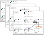
Challenges in set visualization include representing overlaps among sets, changes in their membership, and details of constituent elements. We present a visualization technique that addresses these challenges. The approach uses set intersection graphs that explicitly visualize each set intersection as a rectangular node and elements as circles inside them. We represent the graph as a layered node-link diagram using colors to indicate the sets. The layers reflect different levels of intersections, from the base sets in the lowest layer to potentially the intersection of all sets in the highest layer. We provide different perspectives to show temporal changes in set membership. Graphs for individual, two, and all timesteps are visualized in static, diff, and aggregated views. Together with linked views and filters, the technique supports the detailed exploration of dynamic set data. We demonstrate the effectiveness of the proposed approach by discussing two application examples. The submitted supplemental material contains a video showing proposed interactions in the implementation and the prototype itself.
- Agarwal, Shivam; Auda, Jonas; Schneegaß, Stefan; Beck, Fabian: A Design and Application Space for Visualizing User Sessions of Virtual and Mixed Reality Environments. In: Proceedings of Vision, Modeling, and Visualization. The Eurographics Association, 2020. doi:10.2312/vmv.20201194PDFCitationRecordingAbstractDetails
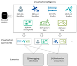
Virtual and mixed reality environments gain complexity due to the inclusion of multiple users and physical objects. A core challenge for developers and researchers while analyzing sessions from such environments lies in understanding the interaction between entities. Additionally, the raw data recorded from such sessions is difficult to analyze due to the simultaneous temporal and spatial changes of multiple entities. However, similar data has already been visualized in other areas of application. We analyze which aspects of these related visualizations can be leveraged for analyzing user sessions in virtual and mixed reality environments and describe a design and application space for such visualizations. First, we examine what information is typically generated in interactive virtual and mixed reality applications and how it can be analyzed through such visualizations. Next, we study visualizations from related research fields and derive seven visualization categories. These categories act as building blocks of the design space, which can be combined into specific visualization systems. We also discuss the application space for these visualizations in debugging and evaluation scenarios. We present two application examples that showcase how one can visualize virtual and mixed reality user sessions and derive useful insights from them.
- Agarwal, Shivam; Herrmann, Christian; Wallner, Günter; Beck, Fabian: Visualizing AI Playtesting Data of 2D Side-scrolling Games. In: Proceedings of IEEE Conference on Games. 2020, p. 572-575. doi:10.1109/CoG47356.2020.9231915PDFCitationRecordingAbstractDetails
Human playtesting is a useful step in the game development process, but involves high economic costs and is time-consuming. While playtesting through artificial intelligence is gaining attention, it is challenging to analyze the collected data. We address the challenge by proposing visualizations to derive insights about level design in 2D side-scrolling games. To focus on the navigation behavior in the level design, we study the trajectories of computer agents trained using artificial intelligence. We demonstrate the effectiveness of our approach by implementing a web-based prototype and presenting the insights gained from the visualizations for the game Sonic the Hedgehog 2. We highlight lessons learned and directions to customize the approach for other analysis goals of playtesting.
- Tarner, Hagen; Frick, Veit; Pinzger, Martin; Beck, Fabian: Visualizing Evolution and Performance Metrics on Method Level as Multivariate Data. In: Seminar Series on Advanced Techniques & Tools for Software Evolution. 2020. PDFCitationAbstractDetails
Visualizing the evolution of software metrics helps understanding the project progress of a software development team with respect to code quality and related characteristics. Blending this information with performance information can provide relevant insights into crucial changes in execution behavior and their respective context from code changes. We interpret this composition of evolution and performance metrics as multivariate data and map it to a fine-grained method level. This is the basis for investigating a multivariate visualization approach consisting of a visually enriched tabular representation that provides the method-level details for all the metrics across time, a projection view that shows clusters and outliers among the methods on a higher-level of abstraction, and a timeline view to find relevant temporal changes. Interactions connect the views and allow the users to explore the data step by step.
- Sancho-Chavarría, Lilliana; Beck, Fabian; Mata-Montero, Erick: An expert study on hierarchy comparison methods applied to biological taxonomies curation. In: PeerJ Computer Science (2020) No 6:e277. doi:10.7717/peerj-cs.277CitationAbstractDetails
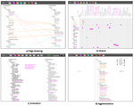
Comparison of hierarchies aims at identifying differences and similarities between two or more hierarchical structures. In the biological taxonomy domain, comparison is indispensable for the reconciliation of alternative versions of a taxonomic classification. Biological taxonomies are knowledge structures that may include large amounts of nodes (taxa), which are typically maintained manually. We present the results of a user study with taxonomy experts that evaluates four well-known methods for the comparison of two hierarchies, namely, edge drawing, matrix representation, animation and agglomeration. Each of these methods is evaluated with respect to seven typical biological taxonomy curation tasks. To this end, we designed an interactive software environment through which expert taxonomists performed exercises representative of the considered tasks. We evaluated participants’ effectiveness and level of satisfaction from both quantitative and qualitative perspectives. Overall quantitative results evidence that participants were less effective with agglomeration whereas they were more satisfied with edge drawing. Qualitative findings reveal a greater preference among participants for the edge drawing method. In addition, from the qualitative analysis, we obtained insights that contribute to explain the differences between the methods and provide directions for future research.
- Agarwal, Shivam; Beck, Fabian: Set Streams: Visual Exploration of Dynamic Overlapping Sets. In: Computer Graphics Forum, Vol 39 (2020) No 3, p. 383-391. doi:10.1111/cgf.13988PDFCitationRecordingAbstractDetails
In many applications, membership of set elements changes over time. Since each element can be present in multiple sets, the sets also overlap. As a result, it becomes challenging to visualize the temporal change in set membership of elements across several timesteps while showing individual set intersections. We propose Set Streams, a visualization technique that represents changing set structures on a timeline as branching and merging streams. The streams encode the changing membership of elements with set intersections. A query-based selection mechanism supports a flexible comparison of selected groups of elements across the temporal evolution. The main timeline view is complemented with additional panels to provide details about the elements. While the proposed visualization is an application-independent visualization technique for dynamic sets, we demonstrate its effectiveness and applicability through three diverse application examples and expert feedback.
- Agarwal, Shivam; Wallner, Günter; Beck, Fabian: Bombalytics: Visualization of Competition and Collaboration Strategies of Players in a Bomb Laying Game. In: Computer Graphics Forum, Vol 39 (2020) No 3, p. 89-100. doi:10.1111/cgf.13965PDFCitationRecordingAbstractDetails
Competition and collaboration form complex interaction patterns between the agents and objects involved. Only by understanding these interaction patterns, we can reveal the strategies the participating parties applied. In this paper, we study such competition and collaboration behavior for a computer game. Serving as a testbed for artificial intelligence, the multiplayer bomb laying game Pommerman provides a rich source of advanced behavior of computer agents. We propose a visualization approach that shows an overview of multiple games, with a detailed timeline-based visualization for exploring the specifics of each game. Since an analyst can only fully understand the data when considering the direct and indirect interactions between agents, we suggest various visual encodings of these interactions. Based on feedback from expert users and an application example, we demonstrate that the approach helps identify central competition strategies and provides insights on collaboration.
- Beck, Fabian; Seo, Jinwook; Wang, Chaoli: Guest Editors’ Introduction: Special Section on IEEE PacificVis 2020. In: IEEE Transactions on Visualization and Computer Graphics, Vol 26 (2020) No 6, p. 2142-2143. doi:10.1109/TVCG.2020.2974638CitationDetails
- Kumar, Ayush; Mohanty, Debesh; Kurzhals, Kuno; Beck, Fabian; Weiskopf, Daniel; Mueller, Klaus: Demo of the EyeSAC System for Visual Synchronization, Cleaning, and Annotation of Eye Movement Data. In: ACM Symposium on Eye Tracking Research and Applications, ETRA '20 Adjunct. ACM, 2020, p. 1-3. doi:10.1145/3379157.3391988PDFCitationAbstractDetails
Eye movement data analysis plays an important role in examining human cognitive processes and perception. Such analysis at times needs data recording from additional sources too during experiments. In this paper, we study a pair programming based collaboration using use two eye trackers, stimulus recording, and an external camera recording. To analyze the collected data, we introduce the EyeSAC system that synchronizes the data from different sources and that removes the noisy and missing gazes from eye tracking data with the help of visual feedback from the external recording. The synchronized and cleaned data is further annotated using our system and then exported for further analysis.
- Okanović, Dušan; Beck, Samuel; Merz, Lasse; Zorn, Christoph; Merino, Leonel; van Hoorn, André; Beck, Fabian: Can a Chatbot Support Software Engineers with Load Testing? Approach and Experiences. In: Proceedings of the ACM/SPEC International Conference on Performance Engineering. ACM, 2020, p. 120-129. doi:10.1145/3358960.3375792PDFCitationAbstractDetails
Even though load testing is an established technique to assess load-related quality properties of software systems, it is applied only seldom and with questionable results. Indeed, configuring, executing, and interpreting results of a load test require high effort and expertise. Since chatbots have shown promising results for interactively supporting complex tasks in various domains (including software engineering), we hypothesize that chatbots can provide developers suitable support for load testing.
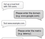
In this paper, we present PerformoBot, our chatbot for configuring and running load tests. In a natural language conversation, PerformoBot guides developers through the process of properly specifying the parameters of a load test, which is then automatically executed by PerformoBot using a state-of-the-art load testing tool. After the execution, PerformoBot provides developers a report that answers the respective concern. We report on results of a user study that involved 47 participants, in which we assessed our tool's acceptance and effectiveness. We found that participants in the study, particularly those with a lower level of expertise in performance engineering, had a mostly positive view of PerformoBot.
- Mumtaz, Haris; Latif, Shahid; Beck, Fabian; Weiskopf, Daniel: Exploranative Code Quality Documents. In: IEEE Transactions on Visualization and Computer Graphics, Vol 26 (2020) No 1, p. 1129-1139. doi:10.1109/TVCG.2019.2934669PDFCitationRecordingAbstractDetails
Good code quality is a prerequisite for efficiently developing maintainable software. In this paper, we present a novel approach to generate exploranative (explanatory and exploratory) data-driven documents that report code quality in an interactive, exploratory environment. We employ a template-based natural language generation method to create textual explanations about the code quality, dependent on data from software metrics. The interactive document is enriched by different kinds of visualization, including parallel coordinates plots and scatterplots for data exploration and graphics embedded into text. We devise an interaction model that allows users to explore code quality with consistent linking between text and visualizations; through integrated explanatory text, users are taught background knowledge about code quality aspects. Our approach to interactive documents was developed in a design study process that included software engineering and visual analytics experts. Although the solution is specific to the software engineering scenario, we discuss how the concept could generalize to multivariate data and report lessons learned in a broader scope.
- Sancho-Chavarría, Lilliana; Gómez-Soza, Carlos; Beck, Fabian; Mata-Montero, Erick: Diaforá: A Visualization Tool for the Comparison of Biological Taxonomies. In: Proceedings of the Latin America High Performance Computing Conference. Springer, 2019, p. 423-437. doi:10.1007/978-3-030-41005-6_29PDFCitationAbstractDetails
We address the problem of visualizing differences between two versions of a biological taxonomy. Given the dynamics of the taxonomic work, taxonomists are often faced with alternative versions of a taxonomy that need to be reconciled. Nevertheless, visual comparison of hierarchies is an open problem that involves several difficult challenges in Visual Analytics. First, how to display not one but two possibly large taxonomies on a fixed-size screen. Second, how to highlight all differences between the two taxonomies. We present Diaforá, an interactive tool that infers and visualizes the differences. Automatic inference is achieved by incorporating taxonomy rules to identify operations such as merging, splitting, and renaming of taxa, among others. Highlighting of differences is accomplished by using the edge drawing technique, which has been enhanced with a number of features suggested by users of a prototype version. Diaforá has been implemented and tested with real world taxonomies such as Bryozoa and Annelida as well as with artificial taxonomies.
- Munz, Tanja; Burch, Michael; van Benthem, Toon; Poels, Yoeri; Beck, Fabian; Weiskopf, Daniel: Overlap-free Drawing of Generalized Pythagoras Trees for Hierarchy Visualization. In: 2019 IEEE Visualization Conference (VIS), Short Papers. IEEE, 2019, p. 251-255. doi:10.1109/VISUAL.2019.8933606PDFCitationAbstractDetails
Generalized Pythagoras trees were developed for visualizing hierarchical data, producing organic, fractal-like representations. However, the drawback of the original layout algorithm is visual overlap of tree branches. To avoid such overlap, we introduce an adapted drawing algorithm using ellipses instead of circles to recursively place tree nodes representing the subhierarchies. Our technique is demonstrated by resolving overlap in diverse real-world and generated datasets, while comparing the results to the original approach.
- Sandoval Alcocer, Juan Pablo; Beck, Fabian; Bergel, Alexandre: Performance Evolution Matrix: Visualizing Performance Variations along Software Versions. In: Proceedings of the 2019 Working Conference on Software Visualization. IEEE, 2019. doi:10.1109/VISSOFT.2019.00009PDFCitationAbstractDetails
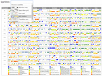
Software performance may be significantly affected by source code modifications. Understanding the effect of these changes along different software versions is a challenging and necessary activity to debug performance failures. It is not sufficiently supported by existing profiling tools and visualization approaches. Practitioners would need to manually compare calling context trees and call graphs. We aim at better supporting the comparison of benchmark executions along multiple software versions. We propose Performance Evolution Matrix, an interactive visualization technique that contrasts runtime metrics to source code changes. It combines a comparison of time series data and execution graphs in a matrix layout, showing performance and source code metrics at different levels of granularity. The approach guides practitioners from the high-level identification of a performance regression to the changes that might have caused the issue. We conducted a controlled experiment with 12 participants to provide empirical evidence of the viability of our method. The results indicate that our approach can reduce the effort for identifying sources of performance regressions compared to traditional profiling visualizations.
Received the VISSOFT 2019 Best Paper Award
- Sandoval Alcocer, Juan Pablo; Camacho Jaimes, Harold; Costa, Diego; Bergel, Alexandre; Beck, Fabian: Enhancing Commit Graphs with Visual Runtime Clues. In: Proceedings of the 2019 Working Conference on Software Visualization. IEEE, 2019. doi:10.1109/VISSOFT.2019.00012PDFCitationAbstractDetails
Monitoring software performance evolution is a daunting and challenging task. This paper proposes a lightweight visualization technique that contrasts source code variation with the memory consumption and execution time of a particular benchmark. The visualization fully integrates with the commit graph as common in many software repository managers. We illustrate the usefulness of our approach with two application examples. We expect our technique to be beneficial for practitioners who wish to easily review the impact of source code commits on software performance.
- Latif, Shahid; Su, Kaidie; Beck, Fabian: Authoring Combined Textual and Visual Descriptions of Graph Data. In: EuroVis 2019 - Short Papers. The Eurographics Association, 2019. doi:10.2312/evs.20191180PDFCitationAbstractDetails
The interactive linking of text and visualizations supports easy and guided exploration of information and results in a coherent
document. Authoring such documents for the web requires writing custom HTML and JavaScript. Existing research aims at
reducing the effort by providing a declarative syntax. However, these approaches either do not support the interactive linking
of text and visualizations or require advance programming skills to establish this linking. Targeting a specific type of data i.e.,
graph data, we introduce an approach that uses a declarative syntax to produce interactive documents and requires little to no
programming. Based on the user specifications in an HTML file, the system queries the database to retrieve subgraphs and link
them to the relevant text fragments. The resulting document consists of a node-link diagram and text; the two representations
are closely linked via interactions and word-sized graphics, and provide an active reading experience. - Mumtaz, Haris; van Garderen, Mereke; Beck, Fabian; Weiskopf, Daniel: Label Placement for Outliers in Scatterplots. In: EuroVis 2019 - Short Papers. The Eurographics Association, 2019. doi:10.2312/evs.20191161 PDFCitationAbstractDetails
In many application scenarios, outliers can be associated with specific importance for various reasons. In such cases, labeling outliers is important to connect them to the actual semantics of the respective entity. In this paper, we present a cost-based greedy approach that places labels with outliers within scatterplots. The approach uses a search strategy to find the position that represents the least cost to place labels. Our approach can also produce different labeling outcomes by adjusting the weights of the criteria of the cost function. We demonstrate our approach with scatterplots produced from object-oriented software metrics, where outliers often relate to bad smells in the software.
- Latif, Shahid; Beck, Fabian: Interactive Map Reports Summarizing Bivariate Geographic Data. In: Visual Informatics, Vol 3 (2019) No 1, p. 27-37. doi:10.1016/j.visinf.2019.03.004PDFCitationAbstractDetails
Bivariate map visualizations use different encodings to visualize two variables but comparison across multiple encodings is challenging. Compared to a univariate visualization, it is significantly harder to read regional differences and spot geographical outliers. Especially targeting inexperienced users of visualizations, we advocate the use of natural language text for augmenting map visualizations and understanding the relationship between two geo-statistical variables. We propose an approach that selects interesting findings from data analysis, generates a respective text and visualization, and integrates both into a single document. The generated reports interactively link the visualization with the textual narrative. Users can get additional explanations and have the ability to compare different regions. The text generation process is flexible and adapts to various geographical and contextual settings based on small sets of parameters. We showcase this flexibility through a number of application examples.
- Okanović, Dušan; van Hoorn, André; Zorn, Christoph; Beck, Fabian; Ferme, Vincenzo; Walter, Jürgen: Concern-driven Reporting of Software Performance Analysis Results. In: Companion of the 2019 ACM/SPEC International Conference on Performance Engineering. ACM, 2019, p. 1-4. doi:10.1145/3302541.3313103PDFCitationAbstractDetails
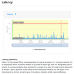
State-of-the-art approaches for reporting performance analysis results rely on charts providing insights on the performance of the system, often organized in dashboards. The insights are usually data-driven, i.e., not directly connected to the performance concern leading the users to execute the performance engineering activity, thus limiting the understandability of the provided result. A cause is that the data is presented without further explanations.
To solve this problem, we propose a concern-driven approach for reporting of performance evaluation results, shaped around a performance concern stated by a stakeholder and captured by state-of-the-art declarative performance engineering specifications. Starting from the available performance analysis, the approach automatically generates a customized performance report providing a chart- and natural-language-based answer to the concern. In this paper, we introduce the general concept of concern-driven performance analysis reporting and present a first prototype implementation of the approach. We envision that, by applying our approach, reports tailored to user concerns reduce the effort to analyze performance evaluation results.
- Latif, Shahid; Beck, Fabian: VIS Author Profiles: Interactive Descriptions of Publication Records Combining Text and Visualization. In: IEEE Transactions on Visualization and Computer Graphics, Vol 25 (2019) No 1, p. 152-161. doi:10.1109/TVCG.2018.2865022PDFCitationRecordingAbstractDetails
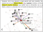
Publication records and collaboration networks are important for assessing the expertise and experience of researchers. Existing digital libraries show the raw publication lists in author profiles, whereas visualization techniques focus on specific subproblems. Instead, we look at publication records from various perspectives mixing low-level publication data with high-level abstractions and background information. This work presents VIS Author Profiles, a novel approach to generate integrated textual and visual descriptions to highlight patterns in publication records. We leverage template-based natural language generation to summarize notable publication statistics, evolution of research topics, and collaboration relationships. Seamlessly integrated visualizations augment the textual description and are interactively connected with each other and the text. The underlying publication data and detailed explanations of the analysis are available on demand. We compare our approach to existing systems by taking into account information needs of users and demonstrate its usefulness in two realistic application examples.
- Latif, Shahid; Beck, Fabian: Visually Augmenting Documents With Data. In: Computing in Science & Engineering (2018), p. 96-103. doi:10.1109/MCSE.2018.2875316PDFCitationAbstractDetails
“A picture is worth a thousand words” is a famous English saying. It is true in many cases, because a complex idea or data can be simply conveyed through the use of a single static image or diagram. Therefore, inclusion of graphics and visualizations in scientific texts has been an important aspect ever since researchers started publishing articles. Conventional writing styles allow researchers to provide images, graphs, and tables to enhance the readability and understandability of the text, but usually, these large-scale images need to be placed at a slightly different location from the relevant text, either on the same page or on the next pages. This far-off placement of graphics forces readers to switch their attention between text and graphics, which can cause a split-attention effect, thereby increasing the cognitive effort to comprehend the information.
- Tarner, Hagen; Frick, Veit; Pinzger, Martin; Beck, Fabian: Exploring Visual Comparison of Multivariate Runtime Statistics. In: 9th Symposium on Software Performance 2018. Hildesheim 2018. PDFCitationAbstractDetails
To understand program behavior or find performance bottlenecks in their software, developers need tools to efficiently compare runtime statistics collected across multiple executions. As there is a variety of useful metrics, a good visualization needs to be able to handle multivariate data and highlight the most important differences between multiple versions. We identify three scenarios for the comparison of execution-relevant changes, and explore possible visualizations of the gathered multivariate runtime statistics.
- Agarwal, Shivam; Bernard, Jürgen; Beck, Fabian: Computer-supported Interactive Assignment of Keywords for Literature Collections. In: Proceedings of the 1st International Workshop on Machine Learning from User Interaction for Visualization and Analytics at IEEE VIS. 2018. PDFCitationAbstractDetails
A curated literature collection on a specific topic helps researchers to find relevant articles quickly. Assigning multiple keywords to each article is one of the techniques to structure such a collection. But it is challenging to assign all the keywords consistently without any gaps or ambiguities. We propose to support the user with a machine learning technique that suggests keywords for articles in a literature collection browser. We provide visual explanations to make the keyword suggestions transparent. The suggestions are based on previous keyword assignments. The machine learning technique learns on the fly from the interactive assignments of the user. We seamlessly integrate the proposed technique in an existing literature collection browser and investigate various usage scenarios through an early prototype.
- Beck, Fabian; Bergel, Alexandre; Bezemer, Cor-Paul; Isaacs, Katherine E.: Visualizing systems and software performance - Report on the GI-Dagstuhl seminar for young researchers, July 9-13, 2018. 2018. doi:10.7287/peerj.preprints.27253v1Full textCitationAbstractDetails
This GI-Dagstuhl seminar addressed the problem of visualizing performance-related data of systems and the software that they run. Due to the scale of performance-related data and the open-ended nature of analyzing it, visualization is often the only feasible way to comprehend, improve, and debug the performance behaviour of systems. The rise of cloud and big data systems, and the rapidly growing scale of the performance-related data that they generate, have led to an increased need for visualization of such data. However, the research communities behind data visualization, performance engineering, and high-performance computing are largely disjunct. The goal of this seminar was to bring together young researchers from these research areas to identify cross-community collaboration and to set the path for long-lasting collaborations towards rich and effective visualizations of performance-related data.
- Sevastjanova, Rita; Beck, Fabian; Ell, Basil; Turkay, Cagatay; Henkin, Rafael; Butt, Miriam; Keim, Daniel; El-Assady, Mennatallah: Going beyond Visualization: Verbalization as Complementary Medium to Explain Machine Learning Models. In: Workshop on Visualization for AI Explainability at IEEE VIS. 2018. PDFCitationAbstractDetails
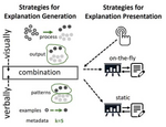
In this position paper, we argue that a combination of visualization and verbalization techniques is beneficial for creating broad and versatile insights into the structure and decision-making processes of machine learning models. Explainability of machine learning models is emerging as an important area of research. Hence, insights into the inner workings of a trained model allow users and analysts, alike, to understand the models, develop justifications, and gain trust in the systems they inform. Explanations can be generated through different types of media, such as visualization and verbalization. Both are powerful tools that enable model interpretability. However, while their combination is arguably more powerful than each medium separately, they are currently applied and researched independently. To support our position that the combination of the two techniques is beneficial to explain machine learning models, we describe the design space of such a combination and discuss arising research questions, gaps, and opportunities.
- Mumtaz, Haris; Beck, Fabian; Weiskopf, Daniel: Detecting Bad Smells in Software Systems with Linked Multivariate Visualizations. In: Proceedings of the 2018 IEEE Working Conference on Software Visualization. IEEE, 2018, p. 12-20. doi:10.1109/VISSOFT.2018.00010PDFCitationAbstractDetails
Parallel coordinates plots and RadViz are two visualization techniques that deal with multivariate data. They complement each other in identifying data patterns, clusters, and outliers. In this paper, we analyze multivariate software metrics linking the two approaches for detecting outliers, which could be the indicators for bad smells in software systems. Parallel coordinates plots provide an overview, whereas the RadViz representation allows for comparing a smaller subset of metrics in detail. We develop an interactive visual analytics system supporting automatic detection of bad smell patterns. In addition, we investigate the distinctive properties of outliers that are not considered harmful, but noteworthy for other reasons. We demonstrate our approach with open source Java systems and describe detected bad smells and other outlier patterns.
- Frick, Veit; Grassauer, Thomas; Pinzger, Martin; Beck, Fabian: Generating Accurate and Compact Edit Scripts using Tree Differencing. In: Proceedings of the 2018 IEEE International Conference on Software Maintenance and Evolution. IEEE, 2018, p. 264-274. doi:10.1109/ICSME.2018.00036PDFCitationAbstractDetails
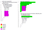
For analyzing changes in source code, edit scriptsare used to describe the differences between two versions of afile. These scripts consist of a list of actions that, applied to thesource file, result in the new version of the file. In contrast toline-based source code differencing, tree-based approaches suchas GumTree, MTDIFF, or ChangeDistiller extract changes bycomparing the abstract syntax trees (AST) of two versions of asource file. One benefit of tree-based approaches is their abilityto capture moved (sub) trees in the AST. Our approach, theIterative Java Matcher (IJM), builds upon GumTree and aims atgenerating more accurate and compact edit scripts that capturethe developer's intent. This is achieved by improving the qualityof the generated move and update actions, which are the mainsource of inaccurate actions generated by previous approaches. To evaluate our approach, we conducted a study with 11 external experts and manually analyzed the accuracy of 2400 randomly selected editactions. Comparing IJM to GumTree and MTDIFF, the resultsshow that IJM provides better accuracy for move and updateactions and is more beneficial to understanding the changes.
- Herr, Dominik; Beck, Fabian; Ertl, Thomas: Visual Analytics for Decomposing Temporal Event Series of Production Lines. In: Proceedings of the 22nd International Conference on Information Visualisation. 2018. PDFCitationAbstractDetails
The temporal analysis of events in a production line helps manufacturing experts get a better understanding of the line's performance and provides ideas for improvement. Especially the identification of recurring error patterns is important, because these patterns can be an indicator of systematic production issues. We present a visual analytics approach to analyze event reports of a production line. Reported events are shown as a time series plot that can be decomposed into a trend, seasonal, and remainder component by applying Seasonal Trend decomposition using Loess (STL). To find specific event patterns, the data is filtered based on aspects such as the event description or the processed product. Identified temporal patterns can be extracted from the original event series and compared visually with each other. In addition to predefined settings, experts can define a subseries of the event series and the period length of STL's seasonal component through an automatically optimized brushing of the undecomposed plot. We developed the approach together with an industry partner. To evaluate our approach, we conducted two pair analytics sessions with our industry partner's experts.
We demonstrate use cases from these sessions that showcase our approach's analytical potential. Moreover, we present general expert feedback that we collected through semi-structured interviews after the pair analytics sessions. - Latif, Shahid; Liu, Diao; Beck, Fabian: Exploring Interactive Linking Between Text and Visualization. In: EuroVis 2018 - Short Papers. 2018, p. 91-94. doi:10.2312/eurovisshort.20181084PDFCitationAbstractDetails
Visualizations are included in documents as augmentation to text and they become more intuitive if readers have the ability to interact with them. Modern web technologies facilitate the development of interactive documents including both text and visualizations. The aim of this research it to explore the design space of possible visualization–text linking and interactions based on various triggers such as mouse events. We describe a framework that takes text containing markup, a related dataset, and a configuration file as inputs and produces an interactive document. The resulting document provides interactions such as details on demand, visual highlighting and comparison, and bushing-and-linking. In addition to regular sized graphics, the use of word-sized graphics or sparklines presents related content in view-focus of the reader. Finally, an illustrative example is presented to showcase the approach.
- Krüger, Robert; Simeonov, Georgi; Beck, Fabian; Ertl, Thomas: Visual Interactive Map Matching. In: IEEE Transactions on Visualization and Computer Graphics, Vol 24 (2018) No 6, p. 1881-1892. doi:10.1109/TVCG.2018.2816219PDFCitationAbstractDetails
Map matching is the process of assigning observed geographic positions of vehicles and their trajectories to the actual road links in a road network. In this paper, we present Visual Interactive Map Matching, a visual analytics approach to fine-tune the data preprocessing and matching process. It is based on ST-matching, a state-of-the-art and easy-to-understand map matching algorithm. Parameters of the preprocessing step and algorithm can be optimized with immediate visual feedback. Visualizations show current matching issues and performance metrics on a map and in diagrams. Manual and computer-supported editing of the road network model leads to a refined alignment of trajectories and roads. We demonstrate our approach with large-scale taxi trajectory data. We show that optimizing the matching on a subsample results in considerably improved matching quality, also when later scaled to the full dataset. An optimized matching ensures data faithfulness and prevents misinterpretation when the matched data might be investigated in follow-up analysis.
- Karch, Grzegorz K.; Beck, Fabian; Ertl, Moritz; Meister, Christian; Schulte, Kathrin; Weigand, Bernhard; Ertl, Thomas; Sadlo, Filip: Visual Analysis of Inclusion Dynamics in Two-Phase Flow. In: IEEE Transactions on Visualization and Computer Graphics, Vol 24 (2018) No 5, p. 1841-1855. doi:10.1109/TVCG.2017.2692781CitationAbstractDetails
In single-phase flow visualization, research focuses on the analysis of vector field properties. In two-phase flow, in contrast, analysis of the phase components is typically of major interest. So far, visualization research of two-phase flow concentrated on proper interface reconstruction and the analysis thereof. In this paper, we present a novel visualization technique that enables the investigation of complex two-phase flow phenomena with respect to the physics of breakup and coalescence of inclusions. On the one hand, we adapt dimensionless quantities for a localized analysis of phase instability and breakup, and provide detailed inspection of breakup dynamics with emphasis on oscillation and its interplay with rotational motion. On the other hand, we present a parametric tightly linked space-time visualization approach for an effective interactive representation of the overall dynamics. We demonstrate the utility of our approach using several two-phase CFD datasets.
- Sancho-Chavarria, Lilliana; Beck, Fabian; Weiskopf, Daniel; Mata-Montero, Erick: Task-based assessment of visualization tools for the comparison of biological taxonomies. In: Research Ideas and Outcomes, Vol 4 (2018) No e25742. doi:10.3897/rio.4.e25742Full textCitationAbstractDetails
Maintenance and curation of large-sized biological taxonomies are complex and laborious activities. Information visualization systems use interactive visual interfaces to facilitate analytical reasoning on complex information. Several approaches such as treemaps, indented lists, cone trees, radial trees, and many others have been used to visualize and analyze a single taxonomy. In addition, methods such as edge drawing, animation, and matrix representations have been used for comparing trees. Visualizing similarities and differences between two or more large taxonomies is harder than the visualization of a single taxonomy. On one hand, less space is available on the screen to display each tree; on the other hand, differences should be highlighted. The comparison of two alternative taxonomies and the analysis of a taxonomy as it evolves over time provide fundamental information to taxonomists and global initiatives that promote standardization and integration of taxonomic databases to better document biodiversity and support its conservation. In this work we assess how ten user visualization tasks for the curation of biological taxonomies are supported by several visualization tools. Tasks include the identification of conditions such as congruent taxa, splits, merges, and new species added to a taxonomy. We consider tools that have gone beyond the prototype stage, that have been described in peer-reviewed publications, or are in current use. We conclude with the identification of challenges for future development of taxonomy comparison tools.
- Beck, Fabian; Siddiqui, Hafiz Ammar; Bergel, Alexandre; Weiskopf, Daniel: Method Execution Reports: Generating Text and Visualization to Describe Program Behavior. In: Proceedings of the 5th IEEE Working Conference on Software Visualization. IEEE, 2017, p. 1-10. doi:10.1109/VISSOFT.2017.14PDFCitationAbstractDetails
To obtain an accurate understanding of a program behavior, developers use a set of tools and techniques such as logging outputs, debuggers, profilers, and visualizations. These support an in-depth analysis of the program behavior, each approach focusing on a different aspect. What is missing, however, is an approach to get an overview of a program execution. As a first step to fill this gap, this paper presents an approach to generate Method Execution Reports. Each report summarizes the execution of a selected method for a specific execution of the program using natural-language text and embedded visualizations. A report provides an overview of the dynamic calls and time consumption related to the selected method. We present a framework to generate these reports and discuss the specific instantiation and phrasing we have chosen. Our results comprise feedback from developers discussing the understandability and usefulness of our approach and a task-based comparison to state-of-the-art solutions.
- Brandt, Sebastian; Striewe, Michael; Beck, Fabian; Goedicke, Michael: A Dashboard for Visualizing Software Engineering Processes based on ESSENCE. In: Proceedings of the 5th IEEE Working Conference on Software Visualization. IEEE, 2017, p. 134-138. doi:10.1109/VISSOFT.2017.14PDFCitationAbstractDetails
While traditional project planning approaches focus on precise scheduling of tasks, the ESSENCE standard proposes a higher-level approach that focuses on monitoring. Hence, a new kind of process visualization that picks up ideas of Kanban boards and physical cards is sketched in the standard. This tool paper presents a dashboard application refining, extending, and implementing these ideas based on five use cases posed by two industry partners. It demonstrates that a high degree of support for project management can be achieved by using a relatively small set of visualization means.
- Vehlow, Corinna; Beck, Fabian; Weiskopf, Daniel: Visualizing Group Structures in Graphs: a Survey. In: Computer Graphics Forum, Vol 36 (2017) No 6, p. 201-225. doi:10.1111/cgf.12872PDFCitationAbstractDetails
Graph visualizations encode relationships between objects. Abstracting the objects into group structures provides an overview of the data. Groups can be disjoint or overlapping, and might be organized hierarchically. However, the underlying graph still needs to be represented for analyzing the data in more depth. This work surveys research in visualizing group structures as part of graph diagrams. A particular focus is the explicit visual encoding of groups, rather than only using graph layout to indicate groups implicitly. We introduce a taxonomy of visualization techniques structuring the field into four main categories: visual node attributes vary properties of the node representation to encode the grouping, juxtaposed approaches use two separate visualizations, superimposed techniques work with two aligned visual layers, and embedded visualizations tightly integrate group and graph representation. The derived taxonomies for group structure and visualization types are also applied to group visualizations of edges. We survey group-only, group–node, group–link, and group–network tasks that are described in the literature as use cases of group visualizations. We discuss results from evaluations of existing visualization techniques as well as main areas of application. Finally, we report future challenges based on interviews we conducted with leading researchers of the field.
- Beck, Fabian; Bergel, Alexandre: Guest editorial of the special section on software visualization. In: Information and Software Technology, Vol 87 (2017), p. 221-222. doi:10.1016/j.infsof.2016.12.002CitationDetails
- Beck, Fabian; Weiskopf, Daniel: Word-Sized Graphics for Scientific Texts. In: IEEE Transactions on Visualization and Computer Graphics, Vol 23 (2017) No 6, p. 1576-1587. doi:10.1109/TVCG.2017.2674958PDFCitationAbstractDetails
Generating visualizations at the size of a word creates dense information representations often called sparklines. The integration of word-sized graphics into text could avoid additional cognitive load caused by splitting the readers' attention between figures and text. In scientific publications, these graphics make statements easier to understand and verify because additional quantitative information is available where needed. In this work, we perform a literature review to find out how researchers have already applied such word-sized representations. Illustrating the versatility of the approach, we leverage these representations for reporting empirical and bibliographic data in three application examples. For interactive Web-based publications, we explore levels of interactivity and discuss interaction patterns to link visualization and text. We finally call the visualization community to be a pioneer in exploring new visualization-enriched and interactive publication formats.
- Blascheck, Tanja; Schweizer, Markus; Beck, Fabian; Ertl, Thomas: Visual Comparison of Eye Movement Patterns. In: Computer Graphics Forum, Vol 36 (2017) No 3, p. 87-97. doi:10.1111/cgf.13170PDFCitationAbstractDetails
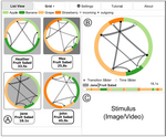
In eye tracking research, finding eye movement patterns and similar strategies between participants’ eye movements is important to understand task solving strategies and obstacles. In this application paper, we present a graph comparison method using radial graphs that show Areas of Interest (AOIs) and their transitions. An analyst investigates a single graph based on dwell times, directed transitions, and temporal AOI sequences. Two graphs can be compared directly and temporal changes may be analyzed. A list and matrix approach facilitate the analyst to contrast more than two graphs guided by visually encoded graph similarities. We evaluated our approach in case studies with three eye tracking and visualization experts. They identified temporal transition patterns of eye movements across participants, groups of participants, and outliers.
- Beck, Fabian; Burch, Michael; Diehl, Stephan; Weiskopf, Daniel: A Taxonomy and Survey of Dynamic Graph Visualization. In: Computer Graphics Forum, Vol 36 (2017) No 1, p. 133-159. doi:10.1111/cgf.12791PDFCitationAbstractDetails
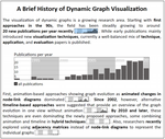
Dynamic graph visualization focuses on the challenge of representing the evolution of relationships between entities in readable, scalable, and effective diagrams. This work surveys the growing number of approaches in this discipline. We derive a hierarchical taxonomy of techniques by systematically categorizing and tagging publications. While static graph visualizations are often divided into node-link and matrix representations, we identify the representation of time as the major distinguishing feature for dynamic graph visualizations: either graphs are represented as animated diagrams or as static charts based on a timeline. Evaluations of animated approaches focus on dynamic stability for preserving the viewer’s mental map or, in general, compare animated diagrams to timeline-based ones. A bibliographic analysis provides insights into the organization and development of the field and its community. Finally, we identify and discuss challenges for future research. We also provide feedback from experts, collected with a questionnaire, which gives a broad perspective of these challenges and the current state of the field.
- Beck, Fabian; Blascheck, Tanja; Ertl, Thomas; Weiskopf, Daniel: Word-Sized Eye Tracking Visualizations. In: Burch, Michael; Chuang, Lewis; Fisher, Brian; Schmidt, Albrecht; Weiskopf, Daniel (Ed.): Eye Tracking and Visualization. Springer, 2017, p. 113-128. PDFCitationAbstractDetails
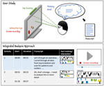
In user studies, eye tracking is often used in combination with other recordings, such as think-aloud protocols. However, it is difficult to analyze the eye tracking data and transcribed recordings together because of missing data alignment and integration. We suggest the use of word-sized eye tracking visualizations to augment the transcript with important events that occurred concurrently to the transcribed activities. We explore the design space of such graphics by discussing how existing eye tracking visualizations can be scaled down to word size. The suggested visualizations can optionally be combined with other event-based data such as interaction logs. We demonstrate our concept by a prototypical analysis tool.
- Schulz, Christoph; Burch, Michael; Beck, Fabian; Weiskopf, Daniel: Visual Data Cleansing of Low-Level Eye Tracking Data. In: Burch, Michael; Chuang, Lewis; Fisher, Brian; Schmidt, Albrecht; Weiskopf, Daniel (Ed.): Eye Tracking and Visualization. Springer, 2017, p. 199-216. PDFCitationAbstractDetails
Analysis and visualization of eye movement data from eye tracking studies typically take into account gazes, fixations, and saccades of both eyes filtered and fused into a combined eye. Although this is a valid strategy, we argue that it is also worth investigating low-level eye tracking data prior to high-level analysis, because today’s eye tracking systems measure and infer data from both eyes separately. In this work, we present an approach that supports visual analysis and cleansing of low-level time-varying data for eye tracking experiments. The visualization helps researchers get insights into the quality of the data in terms of its uncertainty, or reliability. We discuss uncertainty originating from eye tracking, and how to reveal it for visualization, using a comparative approach for disagreement between plots, and a density-based approach for accuracy in volume rendering. Finally, we illustrate the usefulness of our approach by applying it to eye movement data recorded with two state-of-the-art eye trackers.
- Beck, Fabian; Acurana, Yasett; Blascheck, Tanja; Netzel, Rudolf; Weiskopf, Daniel: An Expert Evaluation of Word-Sized Visualizations for Analyzing Eye Movement Data. In: Proceedings of the 2016 IEEE Second Workshop on Eye Tracking and Visualization. 2016, p. 50-54. doi:10.1109/ETVIS.2016.7851166PDFCitationAbstractDetails
Word-sized visualizations for eye movement data allow analysts to compare a variety of experiment conditions or participants at the same time. We implemented a set of such word-sized visualizations as part of an analysis framework. We want to find out which of the visualizations is most suitable for different analysis tasks. To this end, we applied the framework to data from an eye tracking study on the reading behavior of users studying metro maps. In an expert evaluation with five analysts, we identified distinguishing characteristics of the different word-sized visualizations.
- Blascheck, Tanja; Beck, Fabian; Baltes, Sebastian; Ertl, Thomas; Weiskopf, Daniel: Visual Analysis and Coding of Data-Rich User Behavior. In: Proceedings of the IEEE Conference on Visual Analytics Science & Technology 2016. IEEE, 2016, p. 141-150. doi:10.1109/VAST.2016.7883520PDFCitationAbstractDetails
Investigating user behavior involves abstracting low-level events to higher-level concepts. This requires an analyst to study individual user activities, assign codes which categorize behavior, and develop a consistent classification scheme. To better support this reasoning process of an analyst, we suggest a novel visual analytics approach which integrates rich user data including transcripts, videos, eye movement data, and interaction logs. Word-sized visualizations embedded into a tabular representation provide a space-efficient and detailed overview of user activities. An analyst assigns codes, grouped into code categories, as part of an interactive process. Filtering and searching helps to select specific activities and focus an analysis. A comparison visualization summarizes results of coding and reveals relationships between codes. Editing features support efficient assignment, refinement, and aggregation of codes. We demonstrate the practical applicability and usefulness of our approach in a case study and describe expert feedback.
- Beck, Fabian; Burch, Michael; Weiskopf, Daniel: A Matrix-Based Visual Comparison of Time Series Sports Data. In: Vision, Modeling & Visualization. The Eurographics Association, 2016. doi:10.2312/vmv.20161342PDFCitationAbstractDetails
In sports, large amounts of data are measured and stored with the help of modern sensors and electronic devices. In particular, for endurance sports events, time-varying data are recorded and can be used to analyze the athletes' performance. Finding patterns and issues can help better understand results in sports competitions, which is of interest for the athletes, sports managers, and trainers alike. In this paper, we introduce a matrix-based approach to visually compare similar and dissimilar periods in performances of athletes. We differentiate the performances and visually encode these differences as color-coded matrix cells. The strengths of our approach are illustrated in a case study investigating the performances of two riders in the prologue of Tour de France 2012.
- Schulz, Rodrigo; Beck, Fabian; Cerezo Felipez, Jhonny W.; Bergel, Alexandre: Visually Exploring Object Mutation. In: Proceedings of the 4th IEEE Working Conference on Software Visualization. IEEE, 2016. doi:10.1109/VISSOFT.2016.21PDFCitationAbstractDetails
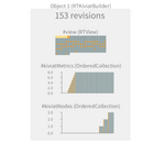
Object-oriented programming supports object mutation during a program execution. A mutation occurs whenever a value is assigned to an object field. Analyzing the evolution of object mutation is known to be difficult. Unfortunately, classical code debuggers painfully support the analysis of object mutations. Object Evolution Blueprint is a visualization dedicated to exploring object mutation over time. Our blueprint visually and concisely represents sequences of field mutations. The history of each field is adequately shown with respect to the dynamic value types. We have observed the use of our blueprint with three practitioners. Our visualization has been well received and accepted to complete two different software comprehension tasks. Moreover, our user study shows that the visualization is both intuitive and simple to learn.
- Vehlow, Corinna; Beck, Fabian; Weiskopf, Daniel: Visualizing Dynamic Hierarchies in Graph Sequences. In: IEEE Transactions on Visualization and Computer Graphics, Vol 22 (2016) No 10, p. 2343-2357. doi:10.1109/TVCG.2015.2507595PDFCitationAbstractDetails
Graphs are used to model relations between objects, where these objects can be grouped hierarchically based on their connectivity. In many applications, the relations change over time and so does the hierarchical group structure. We developed a visualization technique that supports the analysis of the topology and the hierarchical group structure of a dynamic graph and the tracking of changes over time. Each graph of a sequence is visualized by an adjacency matrix, where the hierarchical group structure is encoded within the matrix using indentation and nested contours, complemented by icicle plots attached to the matrices. The density within and between subgroups of the hierarchy is represented within the matrices using a gray scale. To visualize changes, transitions and dissimilarities between the hierarchically structured graphs are shown using a flow metaphor and color coding. The design of our visualization technique allows us to show more than one hierarchical group structure of the same graph by stacking the sequences, where hierarchy comparison is supported not only within but also between sequences. To improve the readability, we minimize the number of crossing curves within and between sequences based on a sorting algorithm that sweeps through the sequences of hierarchies.
- Beck, Fabian; Melcher, Jan; Weiskopf, Daniel: Identifying Modularization Patterns by Visual Comparison of Multiple Hierarchies. In: Proceedings of the 2016 IEEE 24th International Conference on Program Comprehension. IEEE, 2016, p. 1-10. doi:10.1109/ICPC.2016.7503712PDFCitationAbstractDetails
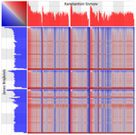
Software is modularized to make its high complexity manageable. However, a multitude of modularization criteria exists and is applied. Hence, to extend, reuse, or restructure a system, it is important for developers to understand which criteria have been used. To this end, we provide an interactive visualization approach that compares the current modularization of a system to several software clustering results. The visualization is based on juxtaposed icicle plot representations of the hierarchical modularizations, encoding similarity by color. A detailed comparison is facilitated by an advanced selection concept. Coupling graphs, which form the basis for software clustering, can be explored on demand in matrix representations. We discuss typical modularization patterns that indicate criteria used for structuring the software or suggest opportunities for partial remodularization of the system. We apply the approach to analyze 16 open source Java projects. The results show that identifying those modularization patterns provides valuable insights and can be done efficiently.
- Sancho-Chavarria, Lilliana; Beck, Fabian; Mata-Montero, Erick; Weiskopf, Daniel: Visual Comparison of Biological Taxonomies: A Task Characterization. In: Poster papers at EuroVis 2016. Eurographics, 2016. PDFCitationAbstractDetails
Although biological taxonomies are a prevalent use case in hierarchy visualization, there has been little research on the characterization of users’ tasks for taxonomy comparison. Task identification is very relevant as a start point to design an effective information visualization solution for taxonomic work. We performed a systematic domain characterization that involved interviews with experts, literature review, the identification of data sources, and a survey of existing software tools. We performed iterative analysis until we reached a satisfactory list of users’ tasks. We present the tasks in a two-level model, describe them, and discuss future work.
- Krüger, Robert; Sun, Guodao; Beck, Fabian; Liang, Ronghua; Ertl, Thomas: TravelDiff: Visual Comparison Analytics for Massive Movement Patterns Derived from Twitter. In: Proceedings of the IEEE Pacific Visualization Symposium. IEEE, 2016, p. 176-183. doi:10.1109/PACIFICVIS.2016.7465266PDFCitationAbstractDetails
Geo-tagged microblog data covers billions of movement patterns on a global and local scale. Understanding these patterns could guide urban and traffic planning or help coping with disaster situations. We present a visual analytics system to investigate travel trajectories of people reconstructed from microblog messages. To analyze seasonal changes and events and to validate movement patterns against other data sources, we contribute highly interactive visual comparison methods that normalize and contrast trajectories as well as density maps within a single view. We also compute an adaptive hierarchical graph from the trajectories to abstract individual movements into higher-level structures. Specific challenges that we tackle are, among others, the spatio-temporal sparsity of the data, the volume of data varying by region, and a diverse mix of means of transportation. The applicability of our approach is presented in three case studies.
- Meyer, Matthias; Beck, Fabian; Lohmann, Steffen: Visual Monitoring of Process Runs: An Application Study for Stored Procedures. In: Proceedings of the IEEE Pacific Visualization Symposium. IEEE, 2016, p. 160-167. doi:10.1109/PACIFICVIS.2016.7465264PDFCitationAbstractDetails
Stored procedures are used in database systems to process and aggregate data. Hundreds of stored procedures often form a complex process network with documented and hidden dependencies that is difficult to understand, maintain, and debug. This paper introduces a novel approach to support such tasks by visually comparing a specific process run to other runs of the same process. The visualization is based on a force-directed node-link diagram arranged on a timeline. Color coding, histograms, and trend charts are used to highlight temporal deviations. The approach has been implemented as an interactive web application and used by professional database developers for solving realistic maintenance and debugging tasks. The feedback of these expert users confirms the usefulness and practical relevance of the approach.
- Beck, Fabian; Koch, Sebastian; Weiskopf, Daniel: Visual Analysis and Dissemination of Scientific Literature Collections with SurVis. In: IEEE Transactions on Visualization and Computer Graphics, Vol 22 (2016) No 1, p. 180-189. doi:10.1109/TVCG.2015.2467757PDFCitationAbstractDetails
Bibliographic data such as collections of scientific articles and citation networks have been studied extensively in information visualization and visual analytics research. Powerful systems have been built to support various types of bibliographic analysis, but they require some training and cannot be used to disseminate the insights gained. In contrast, we focused on developing a more accessible visual analytics system, called SurVis, that is ready to disseminate a carefully surveyed literature collection. The authors of a survey may use our Web-based system to structure and analyze their literature database. Later, readers of the survey can obtain an overview, quickly retrieve specific publications, and reproduce or extend the original bibliographic analysis. Our system employs a set of selectors that enable users to filter and browse the literature collection as well as to control interactive visualizations. The versatile selector concept includes selectors for textual search, filtering by keywords and meta-information, selection and clustering of similar publications, and following citation links. Agreement to the selector is represented by word-sized sparkline visualizations seamlessly integrated into the user interface. Based on an analysis of the analytical reasoning process, we derived requirements for the system. We developed the system in a formative way involving other researchers writing literature surveys. A questionnaire study with 14 visual analytics experts confirms that SurVis meets the initially formulated requirements.
- Beck, Fabian; Burch, Michael; Munz, Tanja; Di Silvestro, Lorenzo; Weiskopf, Daniel: Generalized Pythagoras Trees: A Fractal Approach to Hierarchy Visualization. In: Battiato, Sebastiano; Coquillart, Sabine; Pettré, Julien; Laramee, Robert S.; Kerren, Andreas; Braz, José (Ed.): Computer Vision, Imaging and Computer Graphics - Theory and Applications, VISIGRAPP 2014, Revised Selected Papers. Springer, 2016, p. 115-135. doi:10.1007/978-3-319-25117-2_8PDFCitationAbstractDetails
Through their recursive definition, many fractals have an inherent hierarchical structure. An example are binary branching Pythagoras Trees. By stopping the recursion in certain branches, a binary hierarchy can be encoded and visualized. But this binary encoding is an obstacle for representing general hierarchical data such as file systems or phylogenetic trees, which usually branch into more than two subhierarchies. We hence extend Pythagoras Trees to arbitrarily branching trees by adapting the geometry of the original fractal approach. Each vertex in the hierarchy is visualized as a rectangle sized according to a metric. We analyze several visual parameters such as length, width, order, and color of the nodes against the use of different metrics. Interactions help to zoom, browse, and filter the hierarchy. The usefulness of our technique is illustrated by two case studies visualizing directory structures and a large phylogenetic tree. We compare our approach with existing tree diagrams and discuss questions of geometry, perception, readability, and aesthetics.


